Purpose-Built Apps
A simplified SaaS experience via purpose-built apps.
Context
The classic “Qualtrics” experience was not designed for end users — it was designed for researchers to build surveys. Over time, however, the product offering grew to include People Teams and Human Frontline teams who build programs for their end users. Discovery and basic way-finding issues persisted in the user experience. This resulted in core problems with the architecture and — end-users resorted to book-marking their pages. 😬
Our challenge was two-fold: design a purpose-built app for the People Team’s vertical that was specific to the persona, easy to navigate and adaptable enough to serve as a blueprint for the other verticals: Human Frontline and Research and Strategy.
My input
Discovery 💡
• Review core customer problems and user stories within the people team’s use case
• With with PM to define success metrics, including improving user experience and increasing product stickiness
Concept generation 📐
• Design and information architecture explorations based on user stories
• Determine core page types and high-level data flows
• Conduct tree trust to validate IA and labeling design explorations
• Conduct voice and tone workshop to solidify in-product voice and tone direction
Final design 〰️
• Design information architecture and tagging structure to support discoverability
• Design information flow and value prop
• Design UX writing to improve wayfinding
• Design new user onboarding flow
• Generate a blue-print for future Qualtrics Apps
Concept generation 📐
To kick off the project, I reviewed our high-priority user stories for the People Teams verticals.
High-priority user stories:
• As a team manager, I want a page that summarizes data/tasks so that I know what immediate actions I should take.
• As a team manager, I want to be able to click on a dashboard/report to access the data (without opening a new tab).
• As a team manager, I want to be able to see a list of my action plans so that I can easily access actions I need to take.
• As a team manager, I want to see a list of idea board projects that are available to me, so that I can easily access all my idea boards from one location.
Many of the user stories were centered around themes of actionability and time preservation which gave us a clue for how to focus the app’s content. Next, I aligned this feedback with the business objective to bundle a suite of products into a focused experience and generated a proposed information architecture and data flow.
Artifacts: Information Architecture sketches • Data flow
Concept Validation ✔️
Then, I worked with my UXR partner to understand which labeling structure and IA offers the most intuitive way for the persona to navigate to accomplish their goals. To do this, we conducted a tree test with qualifying participants. This light-weight, multiple choice study asked participants to imagine a scenario or task and then select the label they’d choose to initiate it.

Excerpt from tree test:
Let's say the results from your most recent survey on your team engagement are in. Where would you go to view the results of your recent engagement study?
Answers:
Alt 1: View results
Alt 2: Feedback
Alt 3: View reporting
Alt 4: Feedback > Results
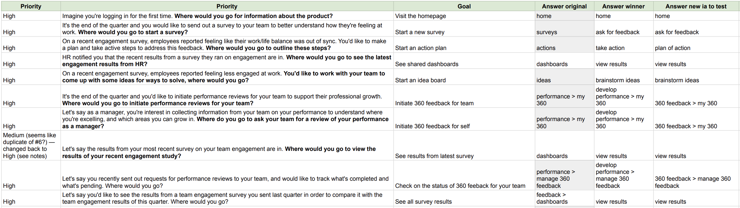
Key insights ⚡️
• The most intuitive IAs are either a shallow or deep navigation structure with task-oriented labels
• Users struggled with understanding where to start a survey
• “Take Action” along with “Ask for Feedback” was interpreted as a place to start a survey
• 360-branded labels and their contents are not intuitive for users
• Users believe that brainstorming ideas go hand-in-hand with action planning
Artifacts: Information architecture • Tree test tasks
Voice and tone 🎶
With our IA and taxonomy validated, we moved on to product voice and tone. I held a workshop to narrow down our tone and product brand identity. The voice is designed to build emotion with the persona — and the tone is designed to respond contextually to how the user might be feeling. I asked participants to review value statements (for voice) and an onboarding flow (for tone), and then reflect on how it made them feel at each moment. Then, I asked them to reflect on its impact on the target persona.
As a result of the workshop, we determined an aspirational voice is best for the product and a friendly and helpful tone is a good baseline — since we knew from user research that the experience of reviewing team feedback can be stressful and demoralizing for the user.

Artifacts: Voice and tone workshop • Voice and tone sketches
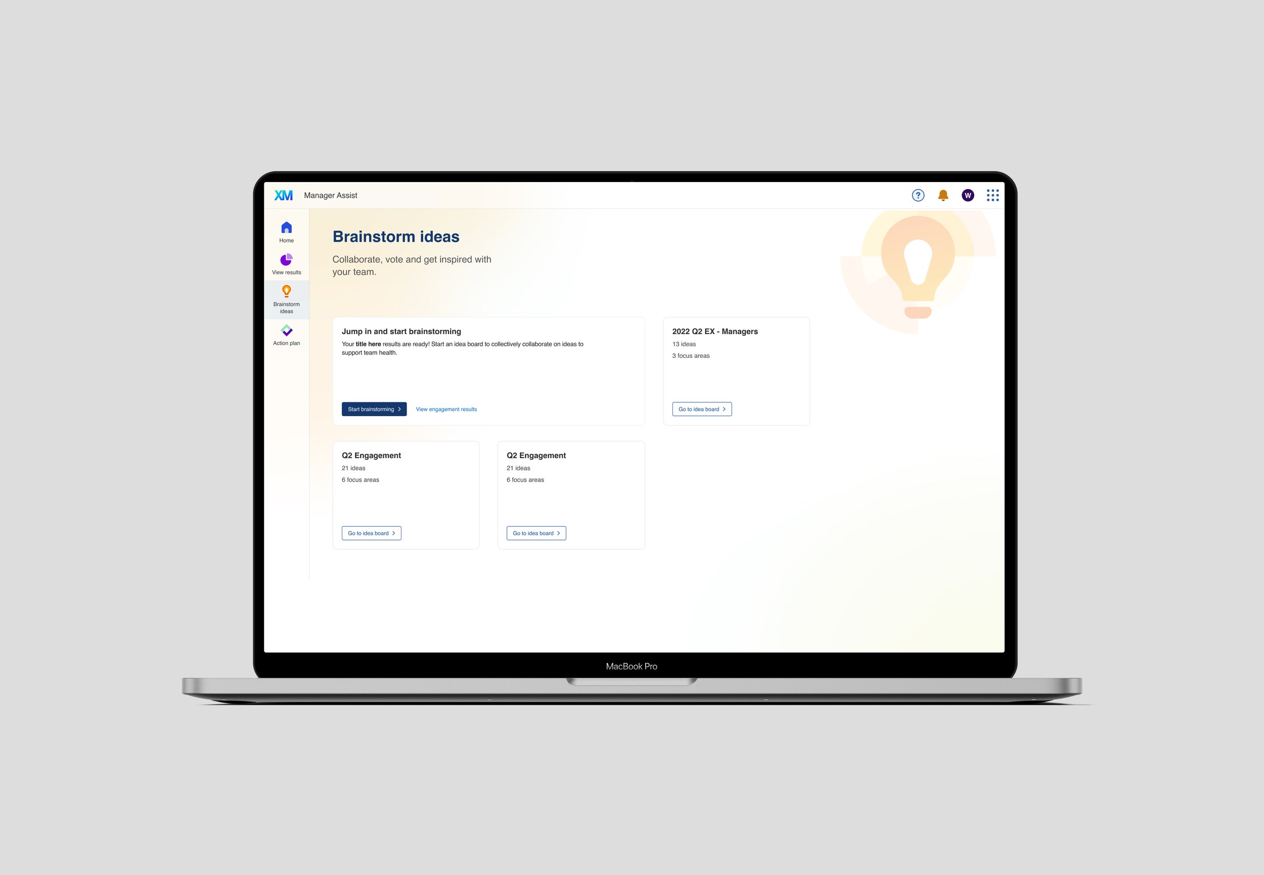
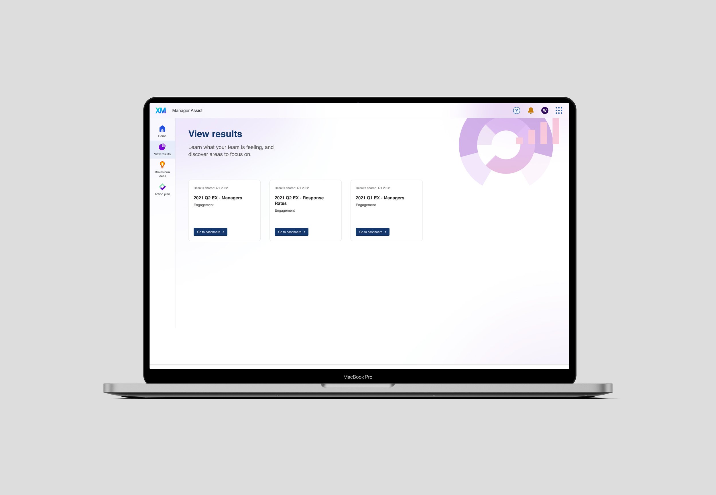
Final design 〰️
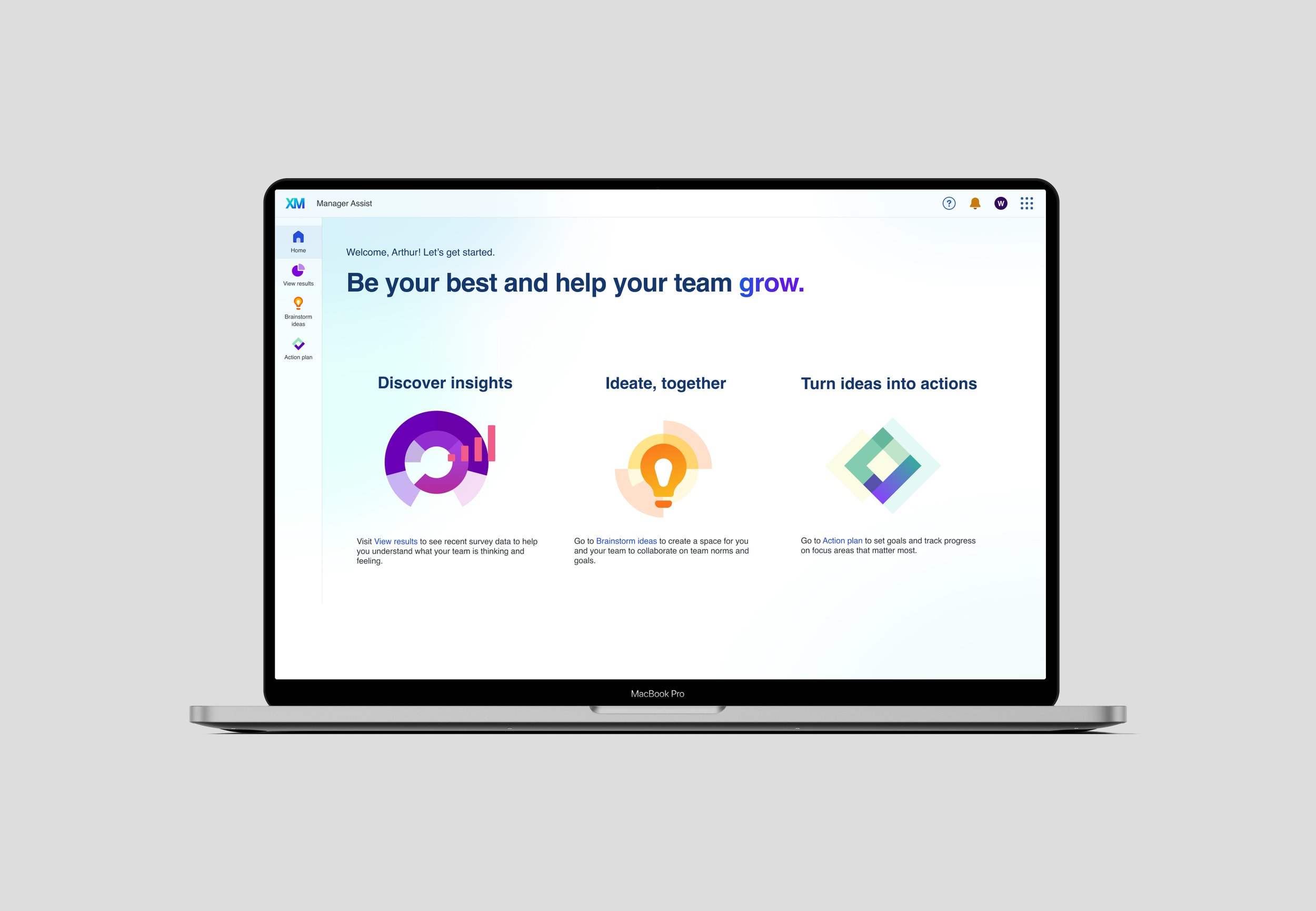
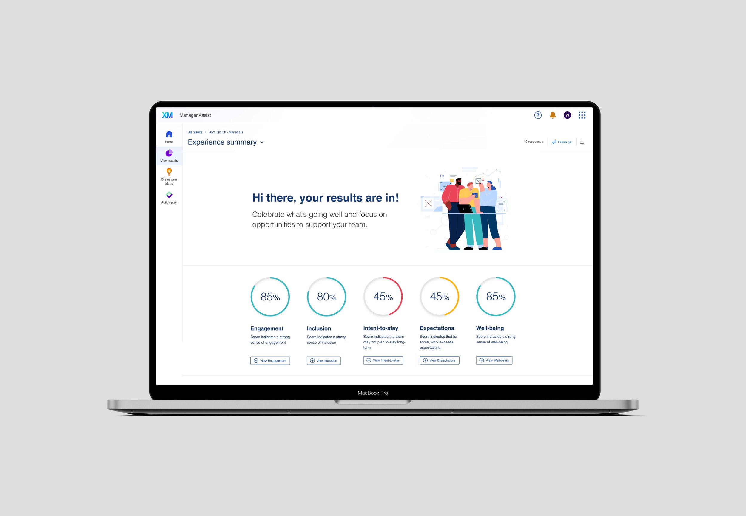
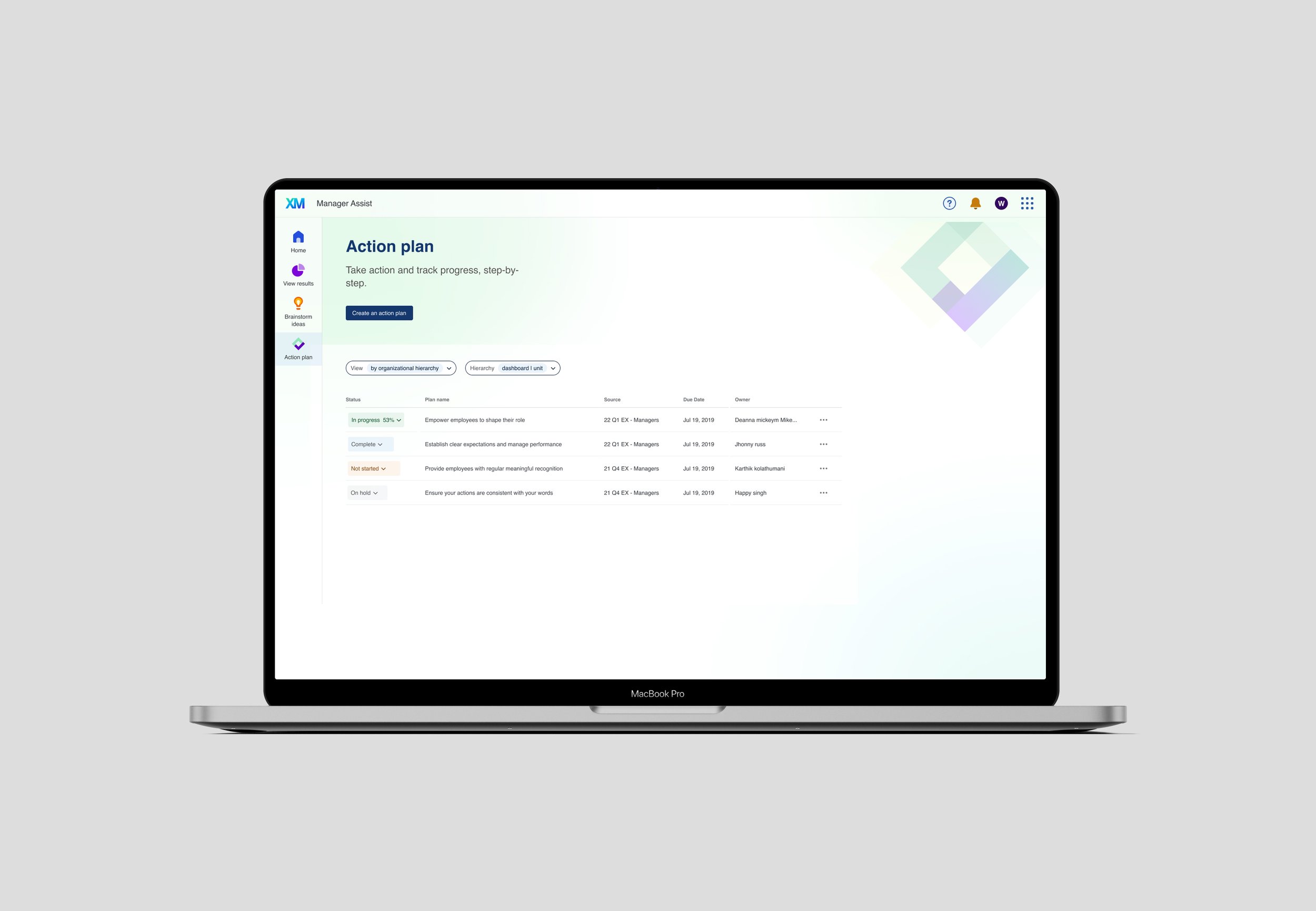
A purpose-built app experience that is designed to meet the needs of People teams. The content, information architecture, UI, and navigation create a simplified experience that is persona-centered and mobile-optimized. The inspirational voice is reflected in the visual design, value proposition, page copy, and labels and the tone is reflected in content details across the experience. And, the voice and tone workshop, and navigation framework, are a blueprint for future purpose-built apps.
Team
Courtney Davis (UX), Claudia Martinez (UX), Lena Tran (UX), David Wang (PM), Will Lowe (Eng), Christian Cabauatan (Eng)
Role
Senior Designer
Stakeholders
Product Management, Engineering, UX Leadership